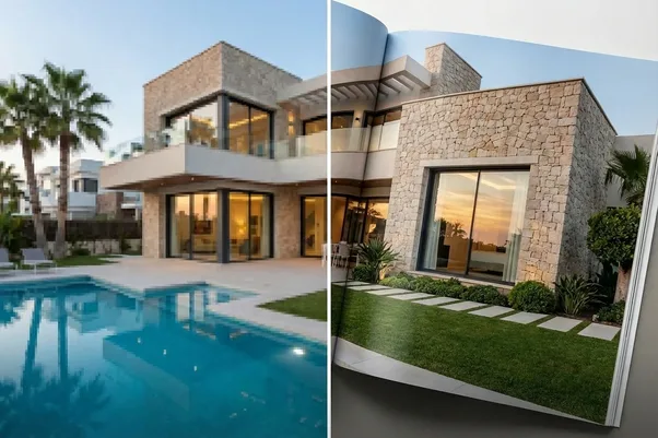
Color Psychology in Real Estate Photo Editing: How Warm vs. Cool Tones Change Perceived Value

When you look at a photo of a home, your brain decides how it feels before you even realize it. The temperature of the light, whether warm and golden or cool and crisp, shapes that reaction in seconds.
That’s the hidden power of real estate photo editing: color tone doesn’t just make a photo look good; it changes how buyers feel about a property’s value. Warm tones create comfort and familiarity, while cool tones suggest modernity and precision. Get it wrong, and even a million-dollar listing can feel uninviting.
At AutoHDR, we see this subtle science play out every day. The best photos don’t just capture the space, they capture emotion through light and tone.
Why Color Temperature Matters in Real Estate
Every light source has a temperature, measured in Kelvin. Lower numbers feel warm (orange and yellow), while higher ones feel cool (blue and white). In photography, this means the same room can feel completely different depending on how the color is balanced.
Warm tones (around 2,700K–3,500K) remind viewers of sunlight, lamps, and comfort. Cool tones (4,500K–6,000K) feel cleaner and sharper, like daylight through a window.
Real estate AI photo editing takes these differences seriously because color balance doesn’t just fix technical exposure, it affects how buyers perceive quality. A warm home feels lived in and inviting. A cool-toned home feels new and sophisticated. The key is matching tone to intention.
The Emotional Impact of Warm Tones
Warm tones appeal to emotion. They create a sense of security and relaxation, making viewers imagine themselves already living in the space.
You’ll often see warm tones used in:
- Family homes with natural wood finishes or warm lighting.
- Cozy interiors like living rooms, bedrooms, or reading corners.
- Evening shots or twilight photos that emphasize glow and comfort.
When used correctly, warm tones make spaces feel “human.” They add personality without oversaturation. For mid-range listings, a slightly warm balance can help buyers connect emotionally faster.
But go too far, and the image can look orange or dated. That’s where skilled real estate AI photo editing, or intelligent color correction, keeps the warmth natural and believable.
The Precision of Cool Tones
Cool tones, on the other hand, project clarity, precision, and sophistication. They’re perfect for modern architecture, minimalist interiors, and high-end finishes like marble or glass.
Blue and white tones signal freshness, think of clean kitchens, luxury bathrooms, or open floor plans with lots of natural light. These spaces look sleek, polished, and expensive when balanced with a slightly cool edit.
However, cool tones can also feel sterile if overdone. Too much blue can make a space seem uninviting. A well-tuned real estate photo editing workflow blends the benefits, keeping whites crisp while retaining just enough warmth to feel real.
Matching Tone to Property Type
The most successful photographers match tone to property identity.
- Cozy suburban home — slightly warm tone; welcoming, familiar.
- Modern luxury condo — cool to neutral tone; clean, sophisticated.
- Rustic cabin — warm tone; inviting, earthy.
- Coastal property — neutral to cool tone; airy, bright.
- Corporate rental — cool tone; professional, minimal.
By thinking intentionally about tone, editors can guide how buyers feel before they even process the layout. The home “speaks” through its color temperature.
How AI and Editing Tools Read Tone
At AutoHDR, tone isn’t an afterthought, it’s part of the core edit. When processing images, the system analyzes light patterns and material colors to decide whether a scene leans warm or cool.
It then adjusts white balance, contrast, and exposure to match natural lighting. A sunset living room retains its golden hue, while a daylight kitchen stays bright and clean. This balance is what makes AI-assisted editing feel human, because it understands mood, not just pixels.
That’s the difference between quick edits and calibrated ones. The best real estate photo editing doesn’t chase one look for every home; it respects the property’s natural identity.
Why Consistency Across a Set Is Crucial
A single warm or cool photo won’t ruin a listing, but inconsistency across a gallery will. When one image feels warm and the next feels cold, the viewer senses something off, even if they can’t name it.
Consistency builds credibility. Every image should share the same tone balance so buyers experience the space as one continuous environment.
This is why professional editing systems and workflows prioritize cognitive consistency, ensuring every photo in a series feels connected in light, mood, and color.
Editing Tone Without Overdoing It
Color editing is a balancing act. The goal isn’t to create extremes but to bring out what’s already there.
If the space has large windows and natural light, lean toward cool tones. If it relies on interior lighting, preserve the warmth. In both cases, avoid pushing saturation too high, real estate photography isn’t about artistic exaggeration; it’s about accuracy that flatters.
The best editors, human or automated, make tone invisible. You don’t notice the temperature; you just feel that the home looks right.
The Value Hidden in the Details
Color temperature might seem like a small detail, but it directly affects perceived value. A well-edited photo makes a $500K property look like $700K, and helps million-dollar listings feel like they’re worth it.
Buyers don’t consciously calculate those differences. They feel them. The emotional pull of warmth or the clarity of coolness shapes trust and desire before a word of description is read.
That’s why mastering tone in real estate photo editing isn’t optional. It’s part of communicating value, silently, but powerfully.
Final Takeaway
Color psychology isn’t abstract theory. It’s one of the most practical tools photographers have to influence how buyers respond.
When you balance warm and cool tones intentionally, your photos don’t just show homes, they sell them.
That’s the art behind real estate photo editing: making light feel natural, emotion feel real, and value feel undeniable.
FAQs
How do warm and cool tones influence buyer perception in real estate photos?
Warm tones tend to make spaces feel comfortable, inviting, and lived-in, while cool tones often create a sense of cleanliness, sophistication, and modernity. The right colour temperature can shape a buyer's emotional response before they even read the property description.
Which types of properties benefit most from warm-toned photo editing?
Warm tones often work well for family homes, traditional interiors, rustic properties, and spaces with natural wood finishes. They help create a welcoming atmosphere and encourage buyers to imagine themselves living in the home.
When are cool tones more effective in real estate photography?
Cool tones are commonly used for modern homes, luxury condos, contemporary apartments, and properties with sleek architectural features. They can highlight clean lines, premium finishes, and a sense of openness while maintaining a polished appearance.
Why is colour consistency important across an entire listing gallery?
Consistent colour temperature and lighting help create a cohesive visual experience. When every image in a gallery shares a similar tone and mood, buyers can focus on the property itself rather than being distracted by noticeable shifts in colour or brightness.
How does AI help optimize colour temperature in real estate photo editing?
AI-powered editing tools can analyze lighting conditions, room materials, and exposure levels to adjust white balance and colour temperature automatically. This helps create natural-looking images while maintaining a consistent style throughout the property gallery.
Can colour temperature affect a property's perceived value?
Yes. Well-balanced colours can make spaces feel brighter, cleaner, more luxurious, or more welcoming depending on the property's style. Because buyers often form emotional impressions within seconds, effective colour correction can enhance the perceived quality and appeal of a listing.